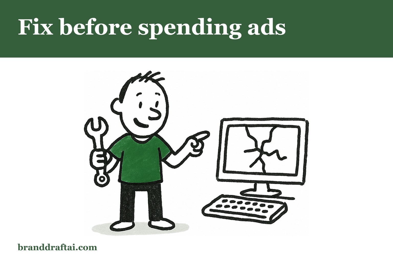

What to fix on your website before you spend another penny on ads
The Facebook campaign ran for three weeks. Decent click-through rates, reasonable cost per click, 847 people landed on the product page. Two sales.
The math doesn't lie , something's wrong with the website, not the ads. But most businesses keep throwing money at traffic instead of fixing what happens after the click.
Your headline either hooks or kills the conversion
The visitor just clicked an ad about "custom kitchen cabinets with soft-close hinges." They land on a page that says "Transform Your Home with Premium Storage Solutions."
That disconnect happens in seconds. The brain expected one thing, saw another, and decided this isn't the right place. Even if both phrases technically mean the same thing, the language mismatch creates doubt.
The headline on your landing page should echo the promise that got them to click. If the ad mentioned a specific product, the headline should too. If they clicked because of a discount, lead with that. The goal isn't clever copy , it's continuity from the ad to the page.
Nobody reads paragraphs that look like walls
Your website might have great information. But if it's packed into dense blocks of text, it might as well be invisible.
People scan web pages in an F-pattern , across the top, down the left side, occasionally across again. They're not reading every word. They're hunting for reasons to care or reasons to leave.
Break up long paragraphs. Use bullet points for lists. Add subheadings every few sentences. White space isn't wasted space , it's the difference between content that gets read and content that gets skipped.
And yes, this means your carefully crafted 200-word product description needs to be shorter. Better to have three sentences read than seven sentences ignored.
Speed problems happen before you notice them
You click around your own website all the time. It feels fast because the pages are already cached in your browser. Your customers don't have that advantage.
Google's page experience research shows that 53% of mobile visitors leave if a page takes longer than three seconds to load. Not five seconds, not ten — three. Most business owners have never actually tested their site speed, which means they're paying for ads that drive traffic to pages they'd never tolerate as visitors themselves.
Run your homepage through Google PageSpeed Insights right now. If the score is below 70 on mobile, you're losing visitors before they see your content. Large images, too many plugins, and cheap hosting are usually the culprits.
Forms ask for information before earning trust
The contact form wants name, email, phone number, company, project budget, and timeline. The visitor just learned your business exists thirty seconds ago.
Every form field is friction. Each additional question reduces completion rates. A HubSpot study found that reducing form fields from four to three increased conversions by 25%.
Start with email only. Once someone's engaged enough to want a quote or consultation, then ask for details. Or better yet, offer something valuable first , a guide, checklist, or sample , before requesting information.
The form that converts isn't the one that captures the most data. It's the one that feels like a fair trade for what you're offering.
Generic content sounds like everyone else
The "About Us" page mentions "innovative solutions" and "commitment to excellence." The product descriptions use industry jargon that customers don't recognise. Everything sounds professional and says nothing.
Generic language is invisible language. When potential customers can't tell the difference between your website and your competitor's, they'll choose based on price alone.
Website content that converts uses specific product names, mentions actual features, and explains benefits in terms customers understand. Instead of "comprehensive digital marketing services," try "SEO audits that identify why you're not ranking for the keywords your customers search."
BrandDraft AI reads your actual website before generating content, so it references real product names and terminology instead of generic industry speak. The output sounds like your business because it knows what your business actually offers.
Social proof sits in the wrong places
Customer testimonials are buried on a separate page. The case studies are three clicks away from the homepage. Five-star reviews are mentioned in the footer.
Social proof works when it appears at the moment of doubt, not after someone's already convinced. Put testimonials on product pages, not just a dedicated reviews section. Show logos of recognizable clients on the homepage. Include a brief case study result near your service descriptions.
People trust other people more than they trust marketing copy. But they need to see that proof when they're deciding, not when they're already sold.
The mobile version wasn't actually designed
Your website might be "mobile responsive," but that doesn't mean it's mobile usable. The contact form requires scrolling in three directions. The phone number isn't clickable. The navigation menu is too small to tap accurately.
More than half your traffic probably comes from mobile devices. If the mobile experience is an afterthought, you're losing half your potential customers.
Test your website on an actual phone, not just a narrow browser window. Try to complete the most important action , making a purchase, requesting a quote, signing up , using only your thumbs. If you get frustrated, your customers definitely will.
What gets measured gets fixed
Most businesses can tell you exactly how much they spent on ads last month. Fewer can tell you which pages visitors left from or where the conversion rate dropped off.
Google Analytics shows you where people enter your site, which pages they visit, and where they exit. Heat mapping tools like Hotjar reveal where people click and how far they scroll. This isn't vanity data , it's diagnostic information.
The page with the highest exit rate needs attention first. The form with the lowest completion rate needs fewer fields. The product page that gets traffic but no sales needs clearer benefits or better proof.
Fix the website before you buy more traffic. More visitors to a broken conversion process just means more people who leave disappointed. And disappointed visitors don't come back, regardless of how good your next ad campaign looks.
Generate an article that actually sounds like your business. Paste your URL, pick a keyword, read the opening free.
Try BrandDraft AI — $9.99